- Jun 3, 2025|Gabbie Rhodes|8 min
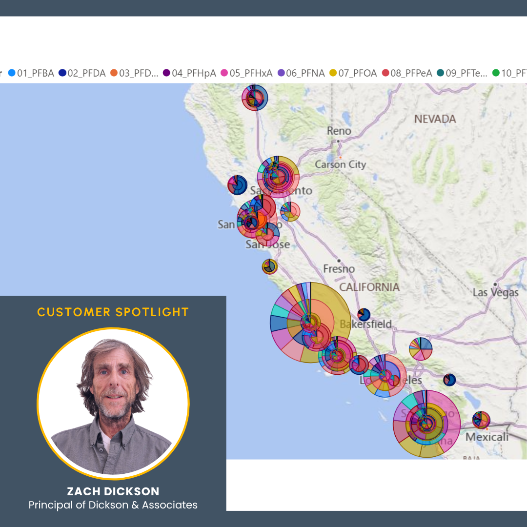
PFAS is an increasingly urgent problem in the U.S., but sometimes, it's hard to understand its impact. Fortunately, new interactive models can help.
- May 29, 2025|Gabbie Rhodes|4 min
Senior Business Development Manager Drew Dudley showed how Surfer empowers users to create great PFAS contamination models. Learn more.
- May 29, 2025|Gabbie Rhodes|4 min
Our team really enjoys building social connections. One way we achieve that goal? Coming together for fun, adventurous team hangouts.
- May 21, 2025|Gabbie Rhodes|7 min
There are many gridding algorithms in Surfer to help you uniquely showcase your data, but there are also common mistakes to avoid.
- May 21, 2025|Gabbie Rhodes|8 min
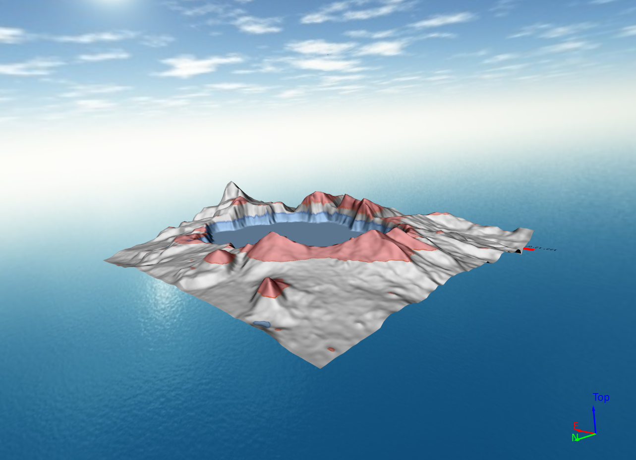
There's nothing wrong with 3D surface maps, but 3D View offers way more options to help you effectively show your data. Learn more.
- May 14, 2025|Gabbie Rhodes|6 min
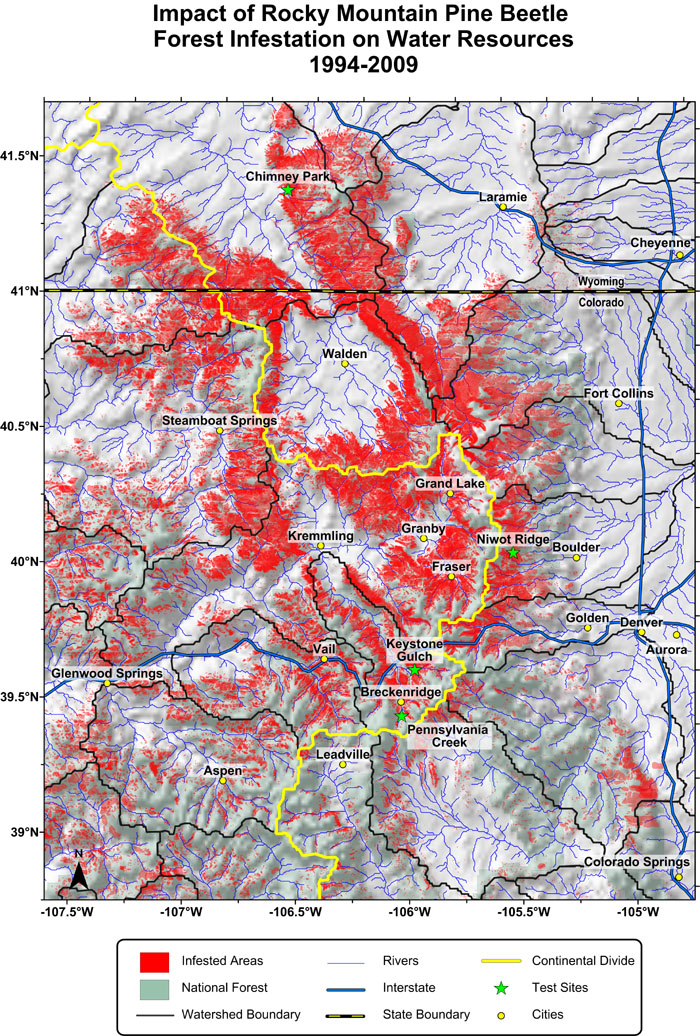
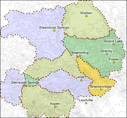
Stakeholders need clear, compelling, and accurate data visualizations to manage water resources. Watershed maps help get the job done.
- May 13, 2025|Gabbie Rhodes|7 min
The latest Grapher release has exciting updates that'll streamline your workflow and help you explore and discover ways to enhance your visuals!
- May 7, 2025|Gabbie Rhodes|4 min
Water availability shifts due to precipitation, runoff, evaporation, and more. How can you visualize the changes? Enter peaks and depressions maps.
- May 7, 2025|Gabbie Rhodes|6 min
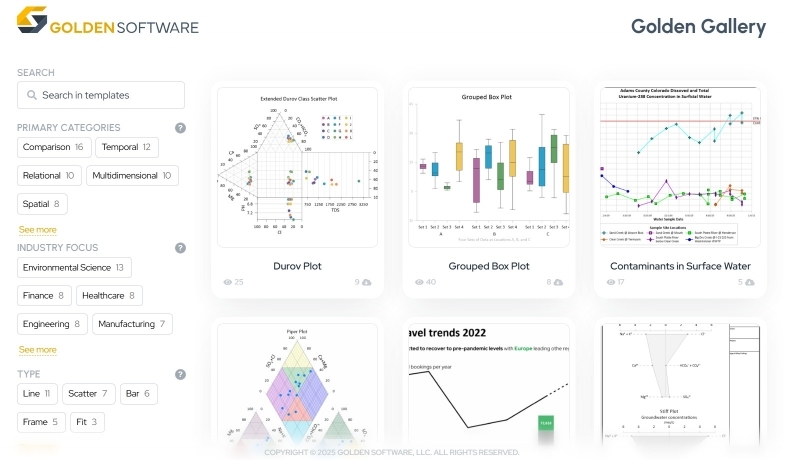
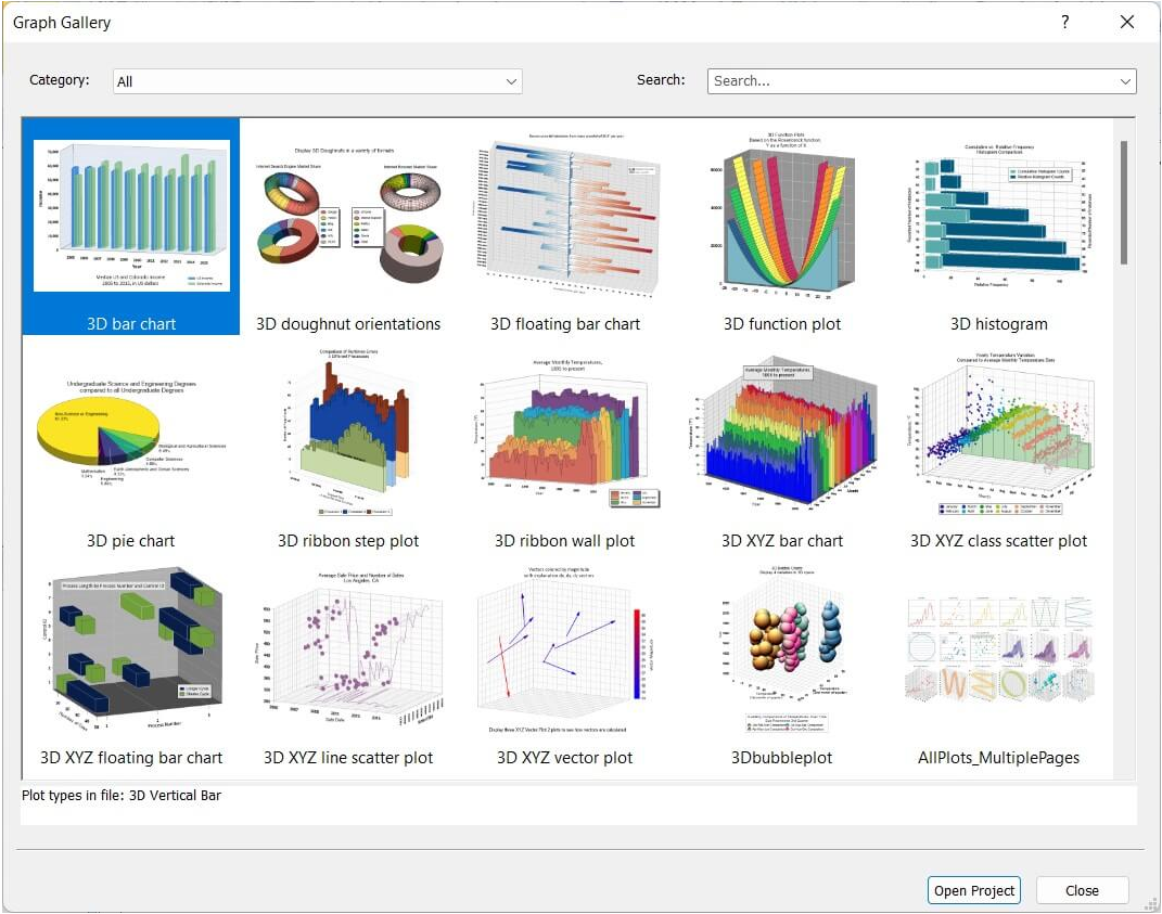
Do you ever need inspiration when creating a new graph? If so, here's good news: you can rely on great examples in Grapher for help.
- Apr 30, 2025|Gabbie Rhodes|7 min
There are multiple benefits of software beta programs, especially the ones at Golden Software. That's why you should participate in them.
- Apr 30, 2025|Gabbie Rhodes|6 min
LiDAR sensors gather high-resolution data, and now point cloud layers in Surfer are helping showcase that data efficiently and clearly.
- Apr 23, 2025|Gabbie Rhodes|11 min
Some data visualizations are so good they stand the test of time. One is a high-profile plot that was created in Surfer and that's still relevant today.
- Apr 23, 2025|Gabbie Rhodes|7 min
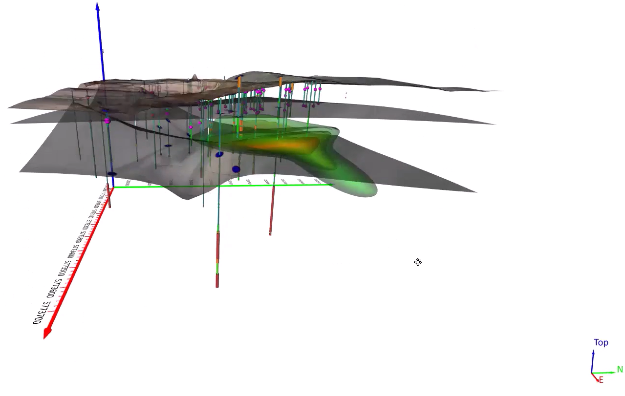
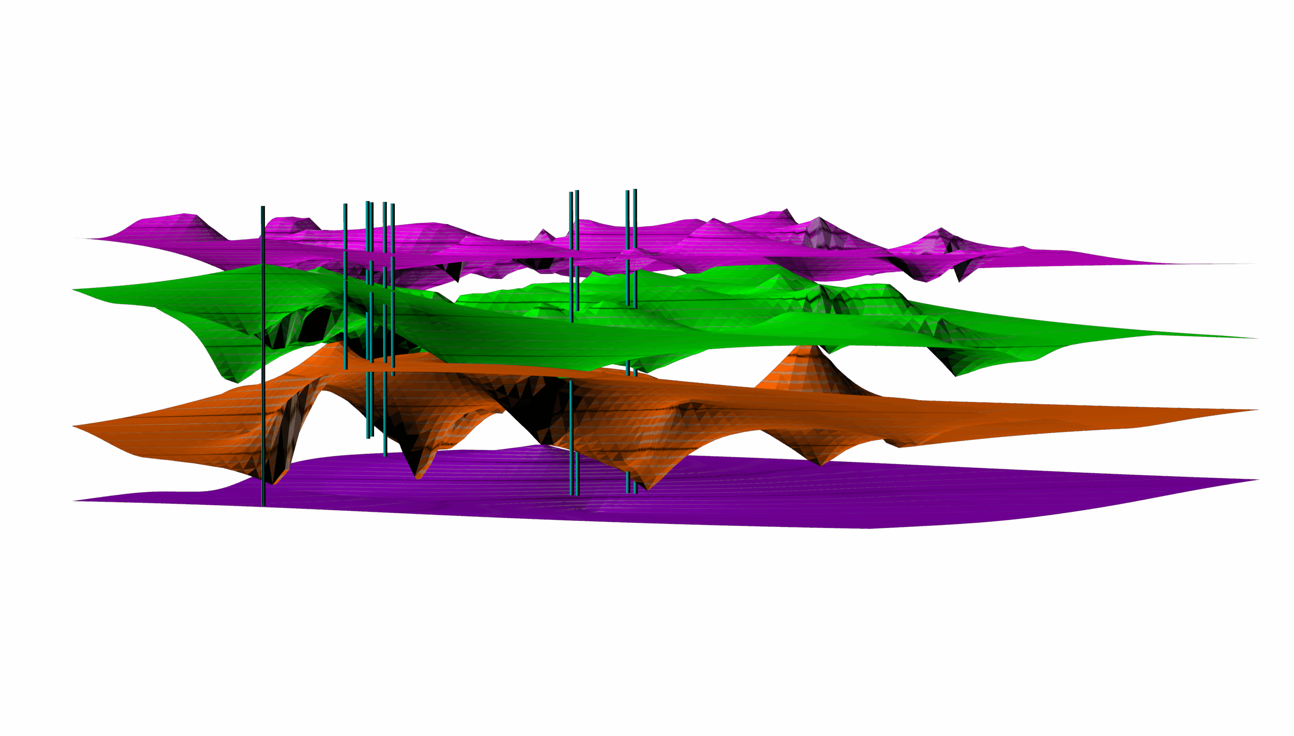
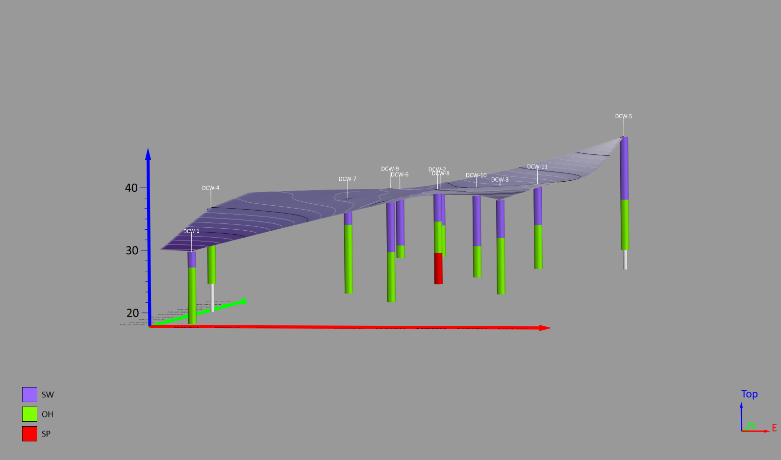
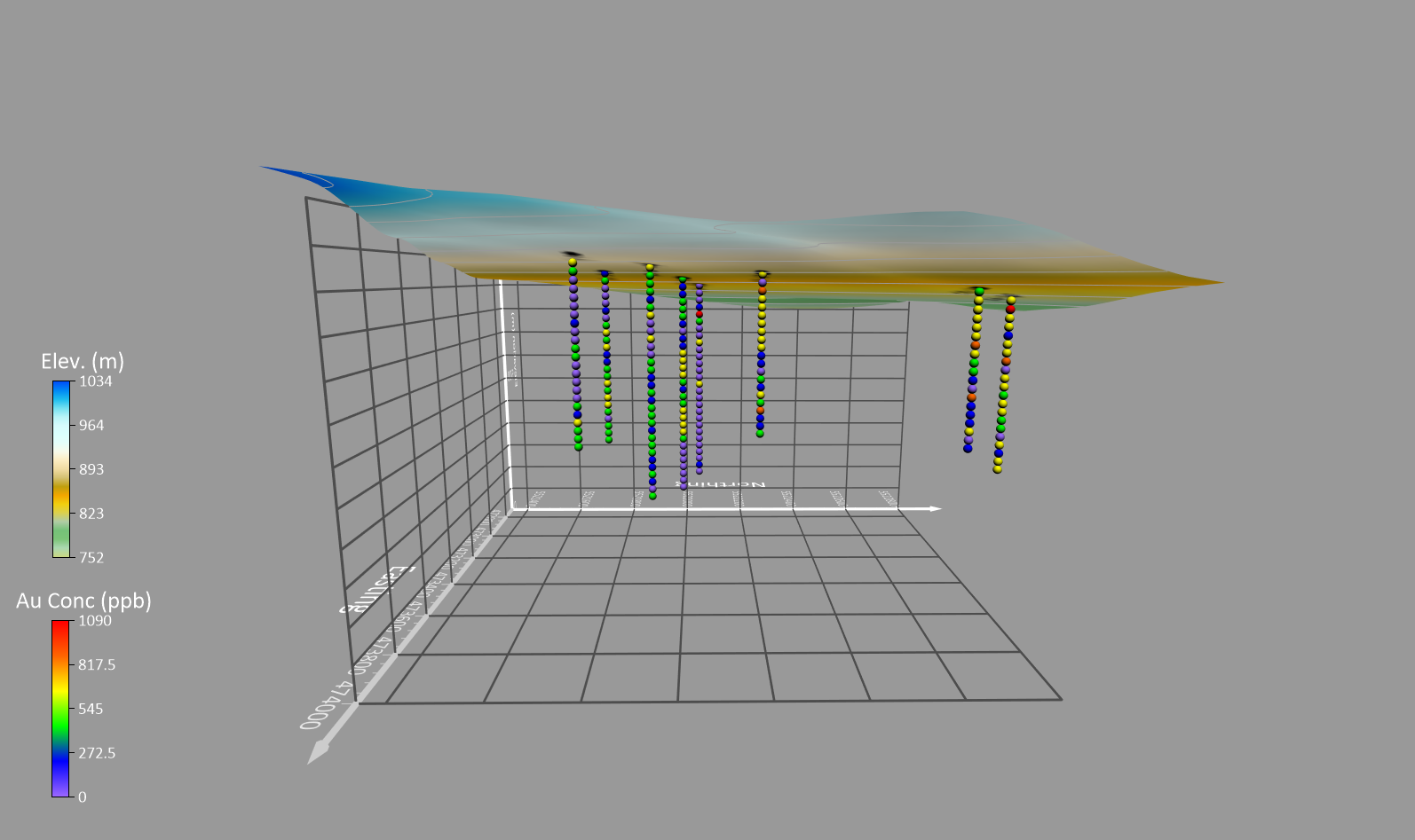
Do you want give stakeholders more insight into the subsurface? There's a specialized map type you should consider using: drillhole maps!
- Apr 16, 2025|Gabbie Rhodes|8 min
Want to make your data visualizations better so they appeal to any audience? We've created an ultimate guide to help you do it. Learn more.
- Apr 16, 2025|Gabbie Rhodes|7 min
What are different types of maps you can use to showcase your data? There are mainstream maps and specialized maps. Learn more.
- Apr 9, 2025|Gabbie Rhodes|7 min
If you're a geoscientist, accurate volume calculation is key, but getting correct results requires careful consideration of multiple factors. Learn more.
- Apr 9, 2025|Gabbie Rhodes|7 min
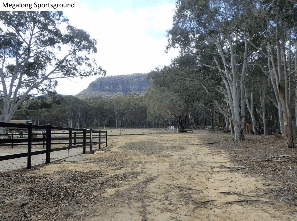
Understanding the view in the Megalong Valley was a goal Peter Hatherly helped people achieve at the Lyrebird Festival. How? Learn more.
- Apr 2, 2025|Gabbie Rhodes|9 min
It's easy to come across a 3D model that inspires you, but how do you take that inspiration to create your own masterpiece? Learn more.
- Apr 2, 2025|Gabbie Rhodes|9 min
If you want to create high-quality, story-driven graphs and charts, you need to think like a designer. Learn what steps to take.
- Mar 26, 2025|Gabbie Rhodes|4 min
Want to create helpful and sleek legends with unique values symbology? If so, we have good news. Surfer is making it easier and faster than ever!