- Mar 26, 2025|Gabbie Rhodes|6 min
You don't create data visualizations for nothing. You want to capture and guide stakeholders' attention. Learn how to do it successfully!
- Mar 19, 2025|Gabbie Rhodes|4 min
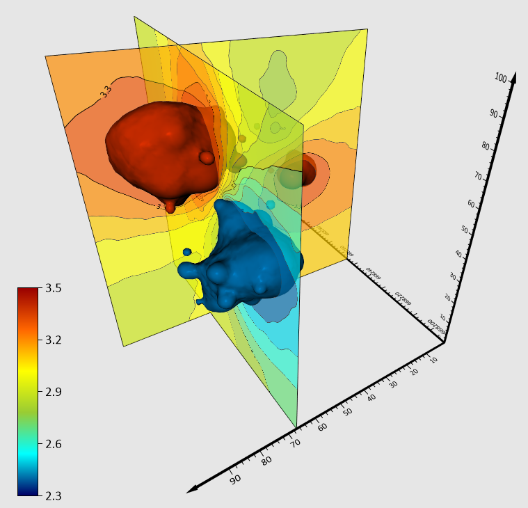
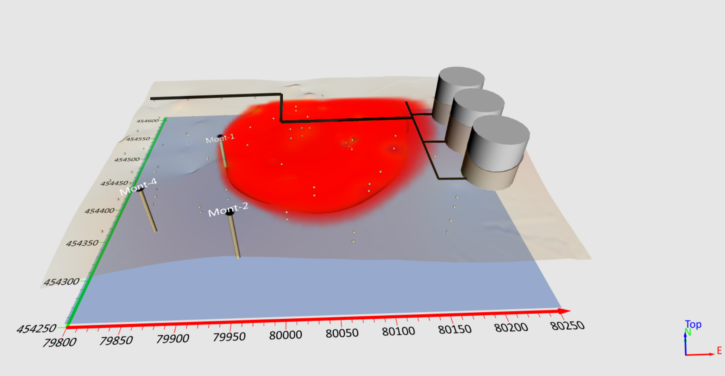
Want to show a more complete picture of concentrations and contaminants in your 3D models? There's a way to do it in Surfer. Learn more!
- Mar 19, 2025|Gabbie Rhodes|9 min
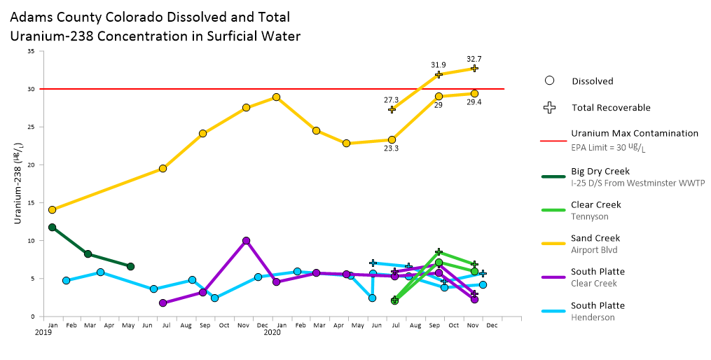
Whether you're creating a graph or chart, there's one thing you must do: de-clutter your data visualization. Here's how to do it effectively.
- Mar 13, 2025|Gabbie Rhodes|4 min
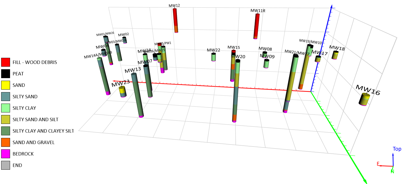
It's critical to clearly label and highlight the geology in your 3D drillholes when your work involves the subsurface. Luckily, Surfer makes it easy.
- Mar 11, 2025|Gabbie Rhodes|5 min
Surfer's latest release is here! Packed with new features, Surfer now equips you to create better maps, models, and reports faster than ever.
- Mar 4, 2025|Gabbie Rhodes|6 min
Before adding another data visualization software to your workflow, you need to ensure it's necessary and able to work well with your other tools.
- Mar 4, 2025|Gabbie Rhodes|10 min
Sometimes, you need help choosing the right type of data visualization. Fortunately, there are ways to discern which visual to pick.
- Feb 26, 2025|Gabbie Rhodes|12 min
It's important to update maps and models when you have new data, but how do you tackle this successfully? Discover best practices.
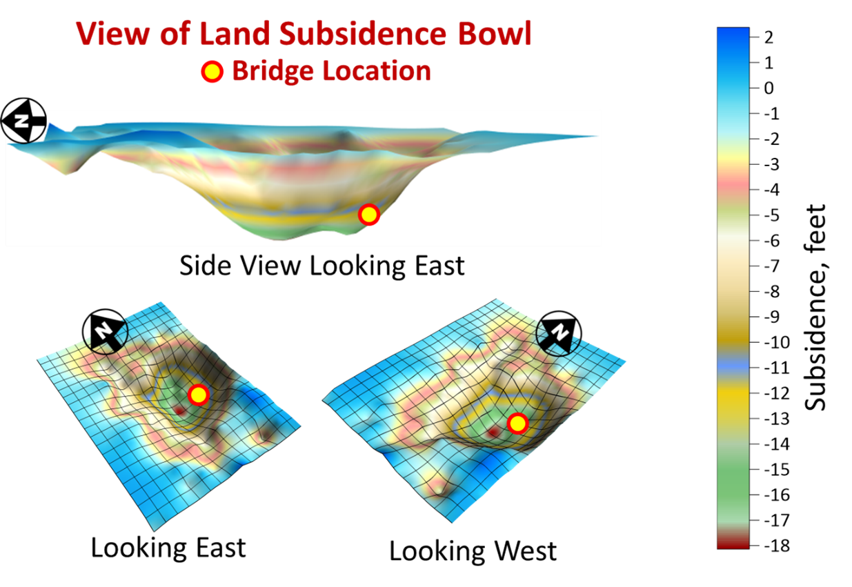
- Feb 26, 2025|Gabbie Rhodes|6 min
When designing and constructing infrastructure, you need to consider land subsidence. Discover how one Surfer user recently approached this.
- Feb 19, 2025|Gabbie Rhodes|5 min
Our team is kicking off a Storytelling With Data series to share the takeaways we took from Cole Nussbaumer Knaflic's book.
- Feb 19, 2025|Gabbie Rhodes|3 min
Want to enhance your maps to wow stakeholders? Focus on this: utilizing map elements. Discover takeaways from our webinar.
- Feb 12, 2025|Gabbie Rhodes|7 min
Have you ever wondered whether to use Surfer, GIS tools, or both? If so, you're asking a great question, and there's a simple answer.
- Feb 12, 2025|Gabbie Rhodes|7 min
It's common to have 2D and 3D data, but how do you create one model when working with different data types? We've got the answer.
- Feb 5, 2025|Gabbie Rhodes|7 min
Color relief maps are one of the most popular types of data visualizations, but where did it come from and why is it so powerful? Learn more.
- Feb 5, 2025|Gabbie Rhodes|7 min
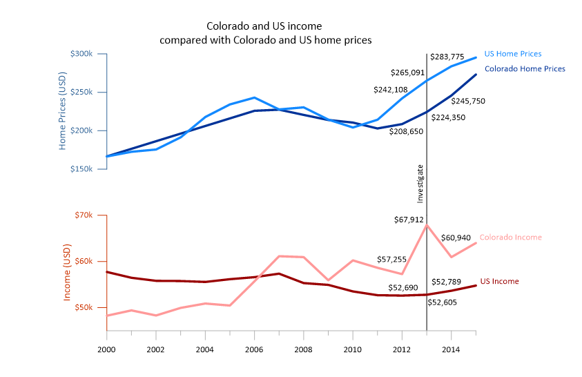
It's common to use data from different sources to create a map, but how do you take everything and design a cohesive visual? Learn more.
- Jan 30, 2025|Gabbie Rhodes|4 min
There are many types of data visualizations to choose from, including 2D and 3D graphs. Learn how to make the right selection.
- Jan 30, 2025|Gabbie Rhodes|7 min
Contour maps are a popular data visualization, but where did this map type come from and how are industries using it today? Learn more!
- Jan 22, 2025|Gabbie Rhodes|10 min
It's common to have data in different coordinate systems. But how do you create a clear, compelling, and accurate map in that situation? Read more.
- Jan 22, 2025|Gabbie Rhodes|6 min
There are many benefits and real-world applications of 3D mapping in geoscience. Curious to know them? Read our latest blog.
- Jan 15, 2025|Gabbie Rhodes|8 min
There are several common mistakes you may make when designing maps and graphs. You can avoid them using data visualization best practices.